Checkout Builder
Checkout builder helps create and maintain several (max 5) different checkout pages and activate any one of them for your eCommerce website. Key offerings of this tool are:
- Offers a competitive set of customization parameters like branding colors, field labels etc.
- Offers a competitive set of configuration like session time out, retries, payment methods to be displayed etc.
- Offers the simulation of checkout experience.
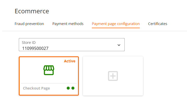
Create a new checkout page
Checkout Builder is a tool to build, customize and publish your payment page. To build a payment page, complete the following steps:
- On the left navigation bar, click "Checkout Builder".
- Hover over the blank tile under "Payment page configurations" and click "Add a checkout page".
- Enter the new checkout page title.
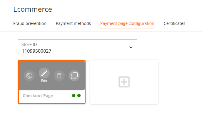
Configure your Checkout page
To edit the checkout page, hover over the payment page you wanted to edit and click the "Edit" icon. You can configure your default payment page by updating several sections.
You have multiple options to display your checkout page by choosing the title, payment section, summary, total, and pay now button wording based on your business needs.
To modify the wordings for the title, field, or button that you want to change, complete the following steps:
- Hover over the title, field, or button you want to change.
- Click the "Edit" icon and select the wording from the dropdown to display on the checkout page.
You can change all the highlighted titles in the following image by clicking on the "Edit" icon.
You can use our Default checkout page to securely accept payments online if you are not using our checkout solution or have not configured your payment page. The Default checkout page gives you the option to use many payment methods securely and reduces the burden of compliance with the Data Security Standard of the Payment Card Industry (PCI DSS).
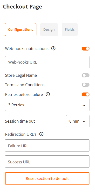
Configurations Tab
Edit your checkout page settings such as DCC, Web-hook notifications, Retries before failure here:
| Configuration Item | Description |
|---|---|
| Web-hook notifications | To receive the web-hook notifications, complete the followings steps: 1. Turn on the Web-hook notifications toggle button. 2. Enter the respective webhook URL under the Web-hooks URL field. |
| Store Legal Name | With this option you can enable your store name to be shown on the Checkout page. |
| Terms and conditions | You can add Terms and Conditions related to the customer on the Checkout page based on your business requirements. To add Terms and Conditions complete the following steps: 1. Turn on the Terms and Conditions toggle button under the Configurator. 2. Enter your terms and conditions URL in the field. |
| Retries before failure | You can enable the option for your customers to retry the transaction several times if the user provided the wrong information during checkout process. |
| Session time out | You can manage your payment page session time out by selecting the Session time out dropdown. The minimum time for session time out is 1 minute, the maximum is 20 minutes. The default value is 8 minutes. |
| Redirection URLs | Enter the Failure and Success redirection URL path in the respective fields. You will be redirected to the Success or Failure URL depending on the payment status. You can always pass new redirection URL using an API request. If you already defined redirection URL using the checkout solution, you can pass new redirection URL using API. The redirection URL that you passed through the API will replace the existing redirection URL. Other options such as DCC, Web-hook notifications, Session time out are optional. |
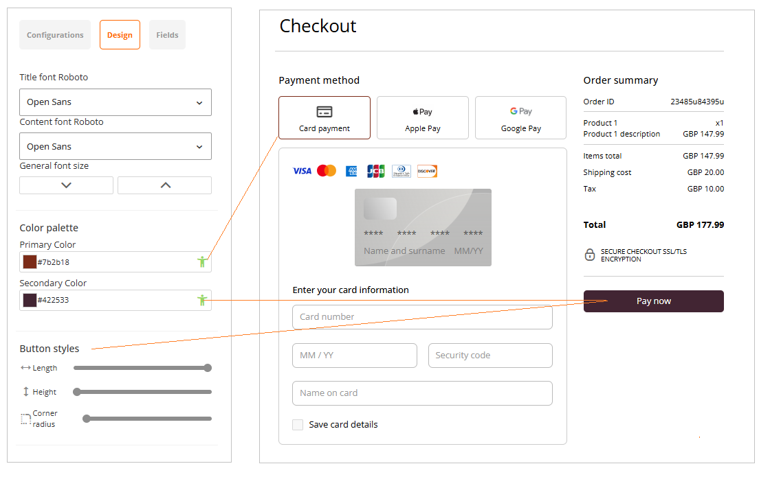
Design Tab
You can modify your default checkout page (look and feel) based on your business needs by using the different options on Design tab.
| Configuration Item | Description |
|---|---|
| Title font | You can change the Title font using the dropdown menu. Click the dropdown menu and select the required font from the displayed list. The default text font is Roboto. |
| Content font | You can change the Content font using the dropdown menu. Click the dropdown menu and select the required font from the displayed list. The default text font is Roboto. |
| General font size | Use the arrows to set up the font size. |
| Color palette | You can change the Primary and Secondary colours using the respective legends. Please make sure, that both colour palettes pass the colour accessibility test for the best visibility (green human icon). |
| Button styles | You can change the "Pay now" button style by adjusting the length, height, and corner radius. |
| Configuration Item | Description |
|---|---|
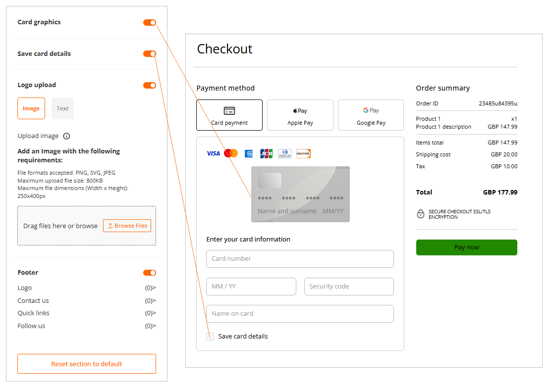
| Card graphics | You can enable or disable the card graphics on your hosted checkout page. |
| Save card details | You can enable "Save card details", if you wish to allow your end-consumers store their card details on file for future use. Saved card details are returned in the form of a token via webhooks. |
| Logo upload | You can upload your preferred logo either in the image or text format. If you want to replace the logo, hover over the refresh icon, click Upload a new file, and click Continue. Note: PNG, SVG, and JPEG are the supported image file formats. The maximum allowed upload file size is 800 KB. The maximum upload file dimensions are 250x400 pixels. |
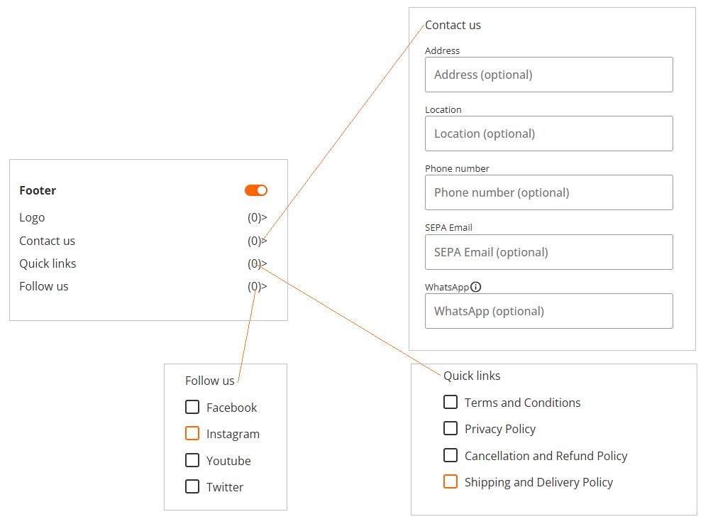
| Footer | This section allows you to define URLs under different disclaimers you wish to appear on the hosted checkout page for your customers. |
Fields Tab
| Configuration Item | Description |
|---|---|
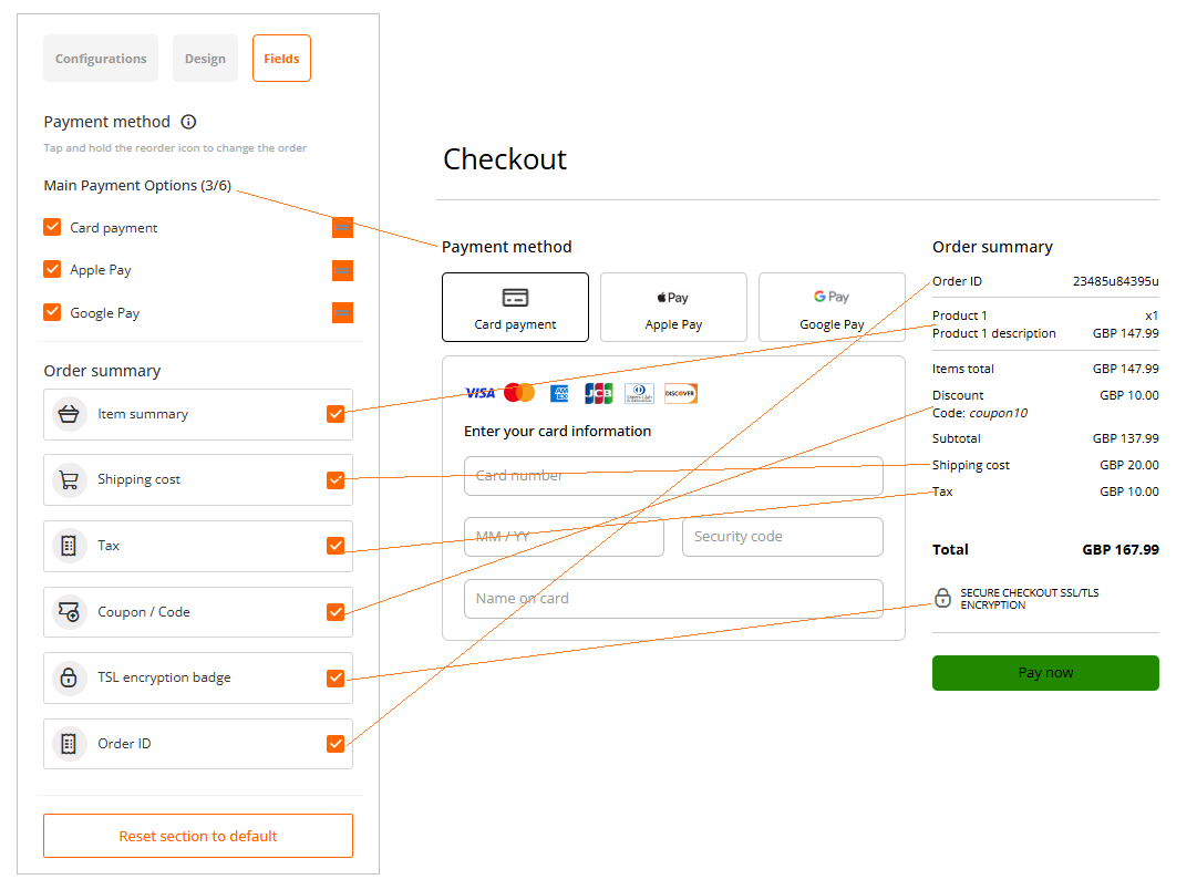
| Main Payment Options | You can set up the order in what payment methods enabled to your store will appear on the hosted checkout page. You can use drag and drop function to change the order for maximum of 6 payment method. For cases where you have more than 6 different payment methods available, all remaining payment methods are automatically sorted into "Other" clickable tile. |
| Order summary | You can select the items which will be shown in "Order summary" section on the hosted checkout page. You can enable or disable each item using the checkboxes. |